Folgers Logo Re-Design
For more than 100 years Folgers has strived for the best quality coffee to provide you. The Folgers story starts in 1850, and its story continues here in 2017. The Folger’s brand is classic, traditional, and encompasses American values (pulling your self up from your bootstraps, striving to create something of value) much like what Folgers’ founder, James Folger, did when creating this timeless company.
That much has not changed, however in a rapidly changing industry it’s important this company stands out among the rest. As a way to update Folgers design to today, I now introduce to you a concept for the re-design of the Folgers Logo.

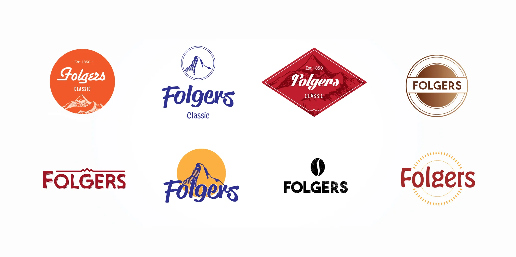
Through out the process of research, sketching, more research and sketching I came up with a selection of logos which might just do the trick!

Chosen Logo
What people associate with Folgers is the mountain and their classic brand color of Red. The use of the mountain is representative of where their quality coffee is grow, in the mountains of South America. The design should have a vintage touch to incorporate a classic feel.