MobilePay Merchant on-boarding
This project is a comprehensive user study I co-conducted on the on-boarding journey of merchant users of MobilePay products. MobilePay’s merchant users are those who use MobilePay (MP) for tranactions in their shops. MobilePay provides different payment options (products) for their merchant users, as different merchants have different needs when it comes to payment types. The insights gathered informed the design and implementation of key improvements, enhancing the user experience and functionality of the on-boarding process.
The Problem Area
The Start
I was given the task of designing a question tree diagram to implement into MobilePay.dk. I looked into the research done to confirm this question tree was the right solution for our user’s needs, but I was only left with more questions. We knew that our merchants were choosing the wrong product, but we didn’t know where in their journey this problem arose. We determined that there was not enough information available to implement the question tree and this kickstarted a large user study on the merchant user journey: from selecting a product to onboarding.
Merchant on-boarding
Merchants users were often picking the wrong product (payment method) for their shops.
The service center received many calls from merchants who were stuck during their on-boarding process.
There was a gap in the research by Mobilepay on their Merchant users and a misalignment between stakeholders.
Team / My Role
For this large user study, we were a team of 3: UX design lead, Digital designer, me (UX/Digital designer)
During the project, I collaborated with the team in project planning and user testing. I led the data analysis, and delivered high-fidelity design prototypes to developers and worked on improving the overall UX for the initial problem areas of the user journey.
Goal
Uncover problem areas within the user on-boarding journey
Provide the results of the user study to all stakeholders, to create alignment on merchant user’s needs
Implement design changes based on findings to improve the merchant on-boarding journey
Process
Data analysis
Data analysis
Interpretation session: All data collected was put into a miroboard where I led the analysis session. The miroboard allowed for easy team collaboration, as this project was done during covid lockdown.
Data analysis
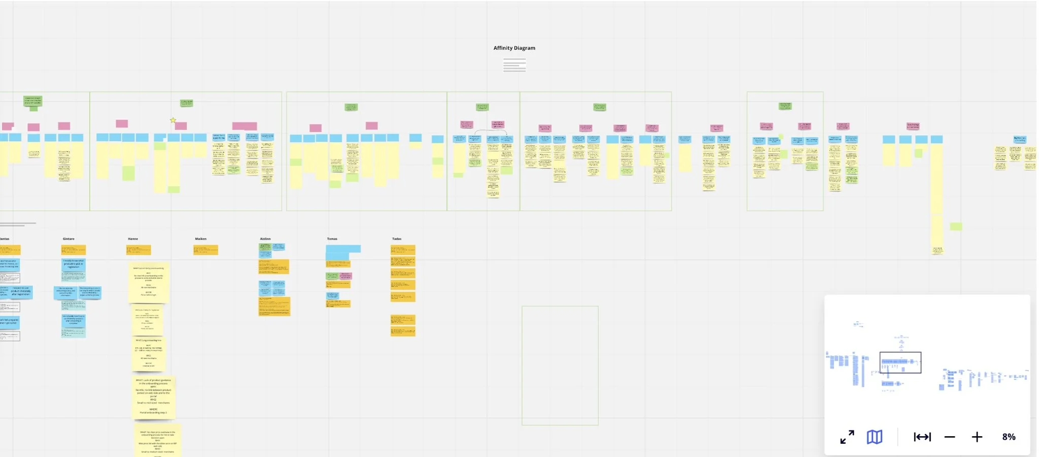
Affinity diagram: At the end of the fourth day the data points where analysed and consolidated.
Project Planning:
Design Sprint
Gathering Data:
Think a loud testing with users
Alignment meetings and internal surveys
Data Analysis:
360 unique data points
Interpretation sessions & Affinity diagram
Findings Outcome
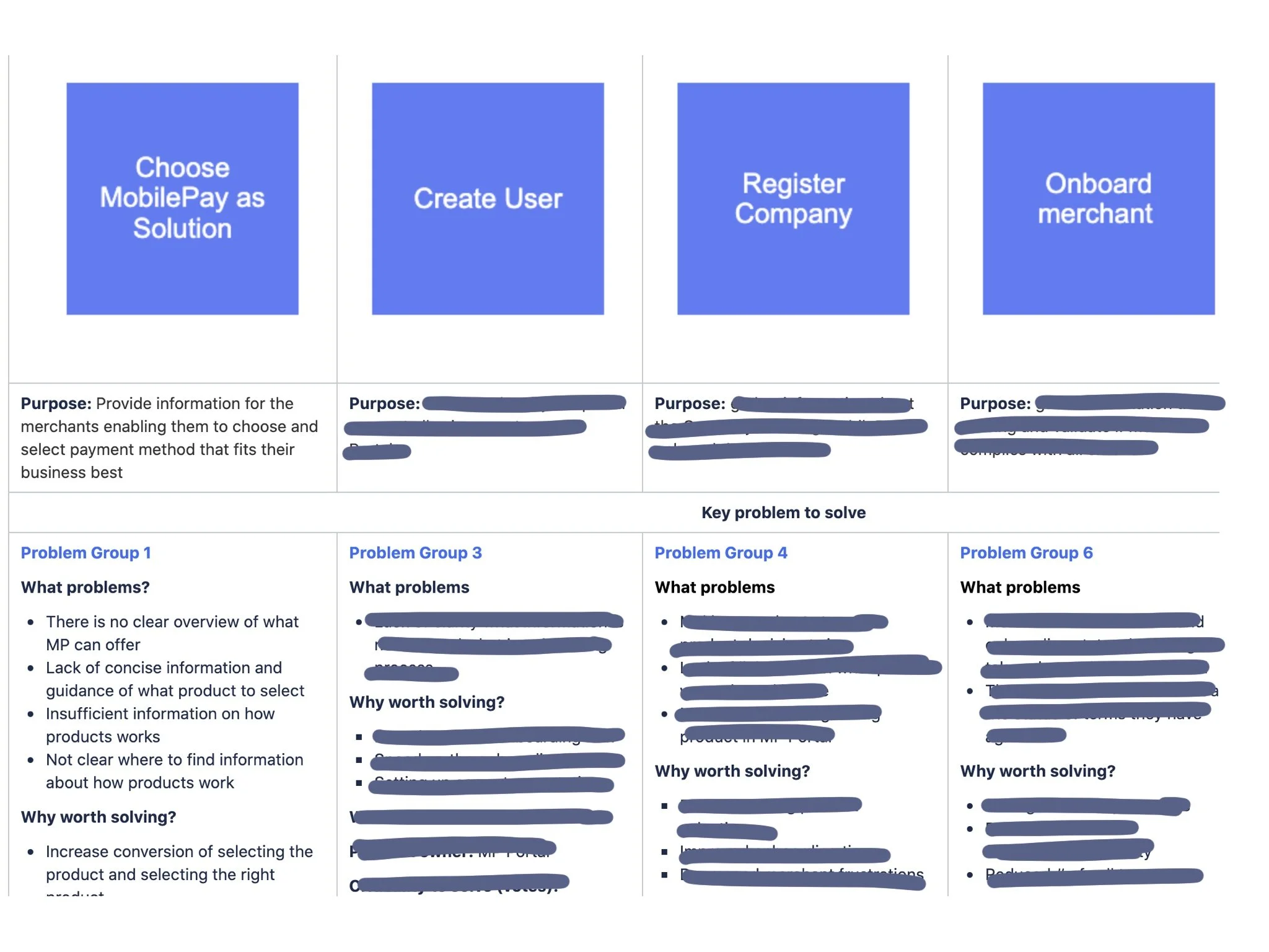
We documented our findings on Confluence, making it accessible to all stakeholders and colleagues. This transparency helps guide current projects and ensure everyone remains aligned on problem areas.
The Exciting Part
Woohoo! With detailed insights into merchant issues, we're ready to start crafting effective solutions!
I was given problem area one, which highlights the issues found in the beginning of the on-boarding journey - Mobilepay.dk
Design
Problem area 1: The Start of the User Journey
I designed for problem area 1, which focused on pains during the beginning of the user journey on Mobilepay.dk.
Navigation Issues
Users encountered many clicks to reach product information. The navigation bar was confusing, leading to a lack of a clear product overview. This excessive "ping-ponging" made it hard for users to get an overview of all products offered and their functionality.
User Confusion
After navigating through multiple clicks, users often landed on a product page only to realise it wasn’t suitable. This left them unsure how to navigate back or find a more appropriate product, resulting in incorrect selections for their shops.
Goals
Streamline Navigation:
Reduce the number of clicks required to reach product information.
Redesign the navigation bar to provide a clear, intuitive path for users.
Enhance Product Overviews:
Design concise summaries of all products.
Ensure each product overview is easily accessible and distinguishable.
Improve User Journey Clarity:
Create a more intuitive back-navigation system.
Implement a clear, easy-to-follow path for users to explore other product options if their first choice isn’t suitable.
By addressing these issues, we aimed to create a smoother, more intuitive experience for our users right from the start.
Website before changes
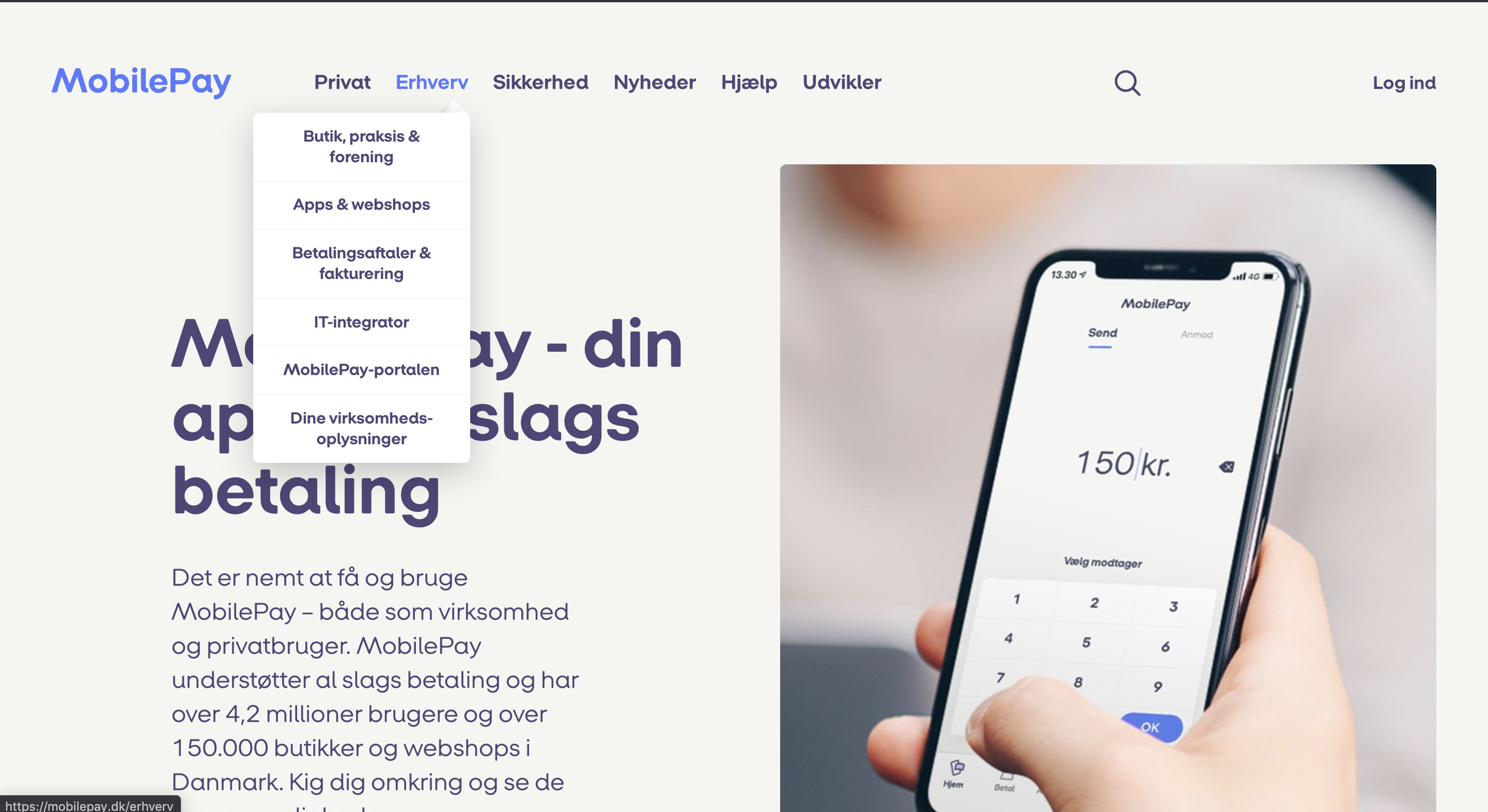
The navigation bar before design changes. The users were confused by the navigation bar wording, and unsure which of the tabs to choose. Some merchants have both a physical store and a webshop, so both tabs would be applicable to them.
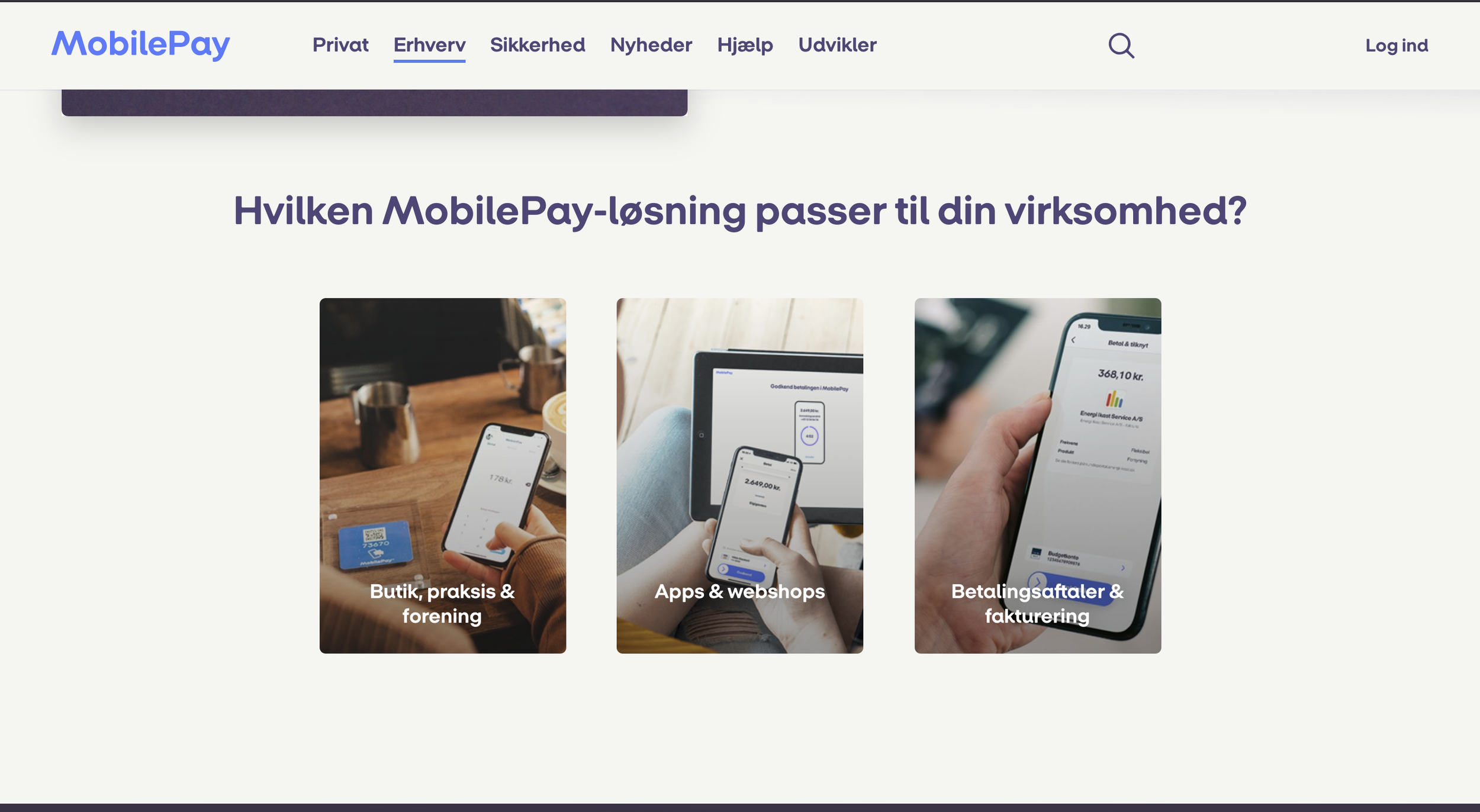
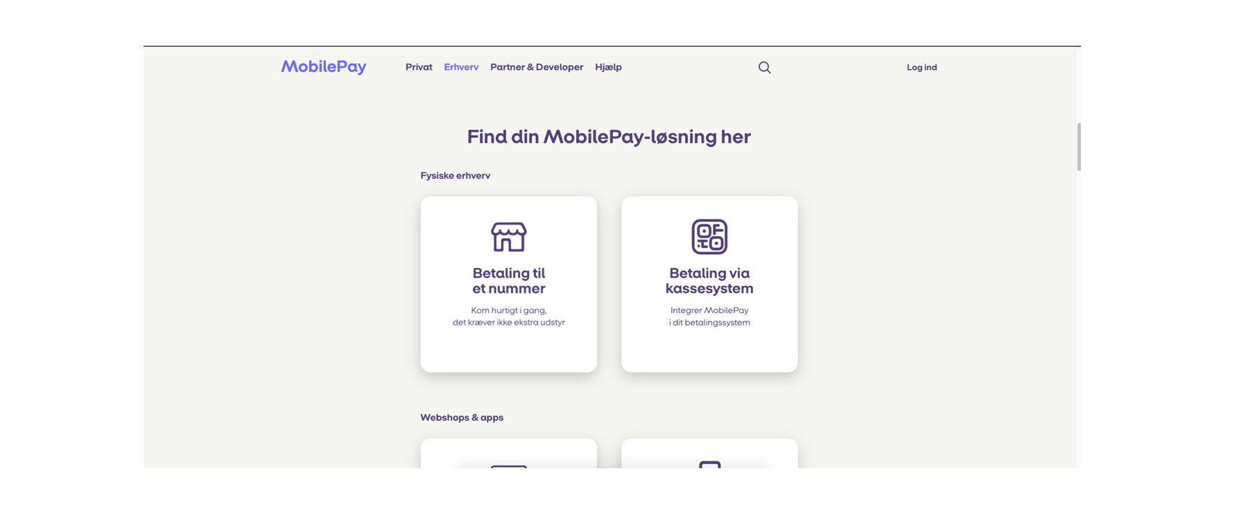
Before re-design when the user would select “Erhverv” they were brought to this page. Here they are presented with the navigation bar options with images. The users did not find the images to be telling of what option was appropriate for their shop.
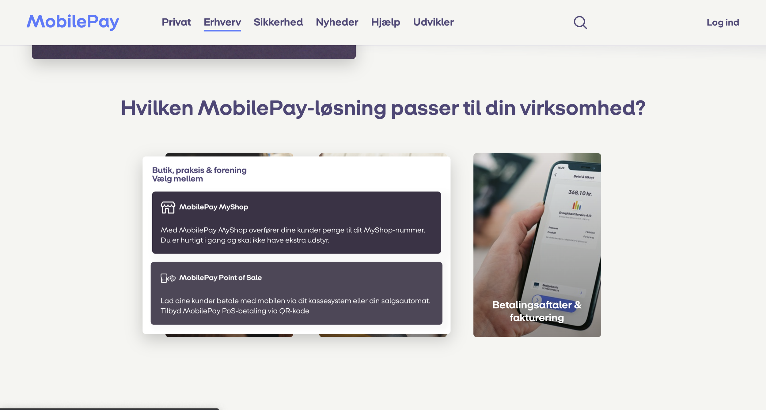
When the user selected one of these images they assumed they would be brought to a new page with information, however they were presented with more options. Again the users found the wording confusing.
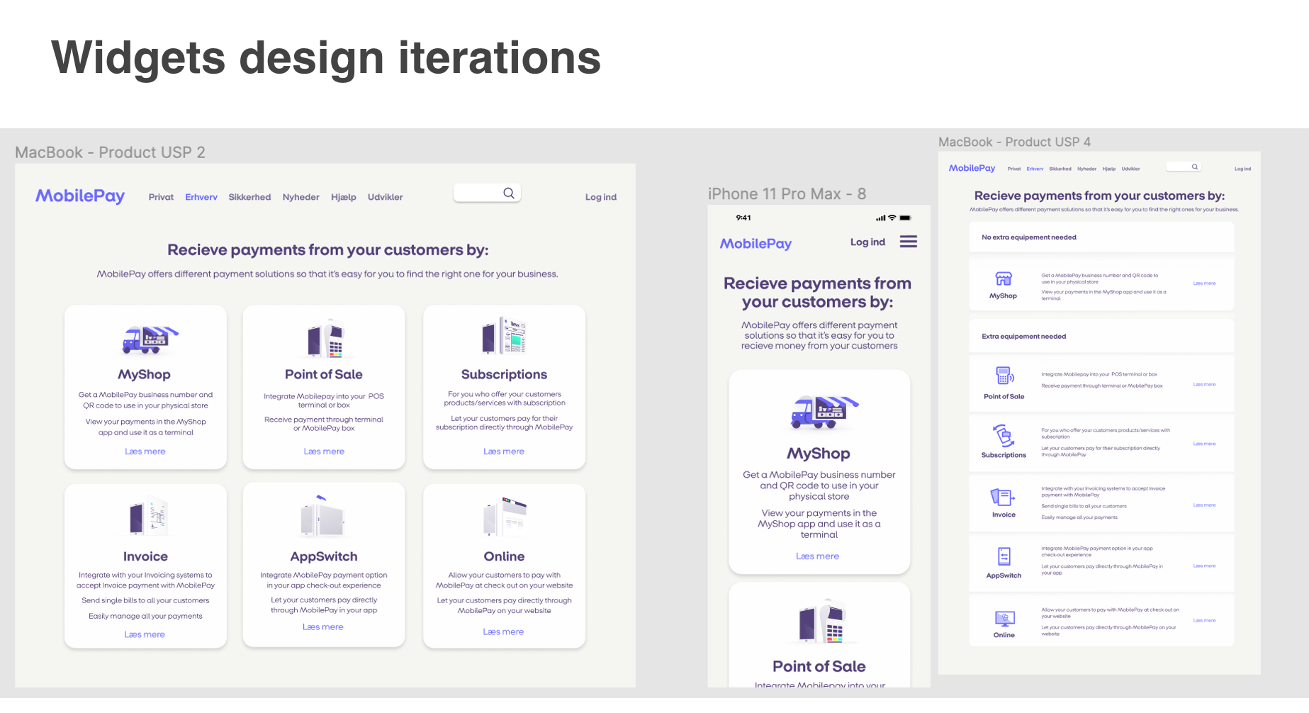
Design Iterations
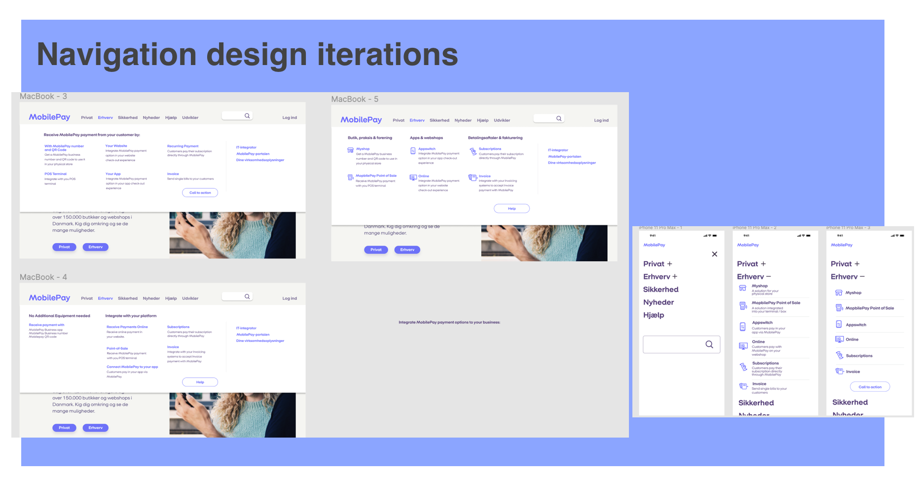
Design iterations were presented to stakeholders and users. Based on their feedback, I made the necessary design changes. The design was them implemented into MobilePay.dk.
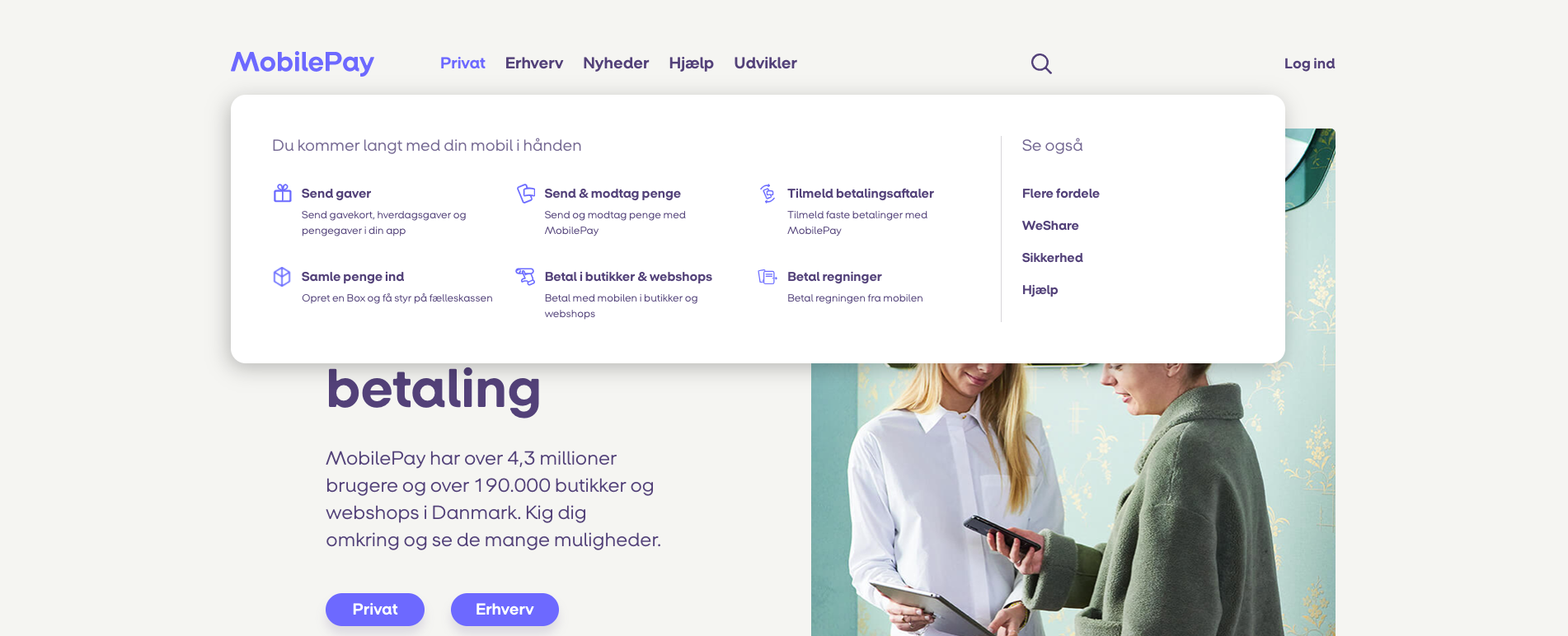
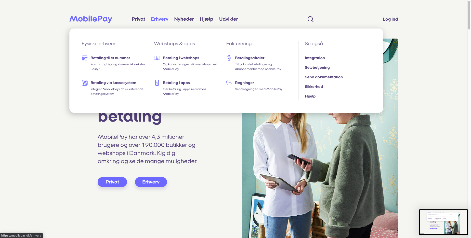
New Navigation Bar: I redesigned the navigation bar to be more detailed and intuitive. The new format allowed users to navigate directly to product pages without unnecessary clicks, reducing user confusion and improving the overall browsing experience. By clearly outlining all products with brief descriptions, users can easily explore their options without feeling overwhelmed or lost.
Product Widgets: To further enhance user experience, we introduced product widgets that provide concise summaries of each product. Several versions were tested, including one with images to aid in user understanding and interpretation. These images help users quickly grasp the product features and benefits, making the selection process more straightforward.
Design Considerations:
Spacing:
Ensured adequate spacing between navigation items to prevent clutter and enhance readability.
Used consistent margins and padding to create a balanced and visually appealing layout.
Color Palette:
Applied MobilePay’s existing color palette to maintain brand consistency.
Used contrasting colors for text and background to improve visibility and accessibility.
Typography:
Selected fonts consistent with MobilePay’s brand guidelines.
Varied font sizes and weights to create a clear visual hierarchy.
Product Descriptions:
Incorporated mini-descriptions directly in the navigation bar.
Used concise and clear language to immediately inform users about each product.
Brand Integration:
Ensured the new navigation bar and widgets aligned with MobilePay’s overall aesthetic.
Maintained visual coherence with the existing website elements.
Visual Cues:
Added icons and visual markers to enhance user understanding and guide navigation.
Employed hover effects and active states to provide feedback and improve interactivity.
Final Design
The new navigation bar offers a streamlined, intuitive path for users, directly linking to product pages and providing mini-descriptions.
Information widgets strategically placed to offer quick access to key details, supporting a seamless user journey.
By focusing on user feedback and iterative testing, the new design effectively addresses the issues of navigation complexity and user confusion, resulting in a more intuitive and user-friendly experience on MobilePay.dk.
Here is the new navigation bar design. It was also implemented on the “Privat” tab of the navigation bar.
Ultimately a more simplistic design was implemented, as updating existing design templates was more time effective.
